Style Guide Upgrade Unlocked
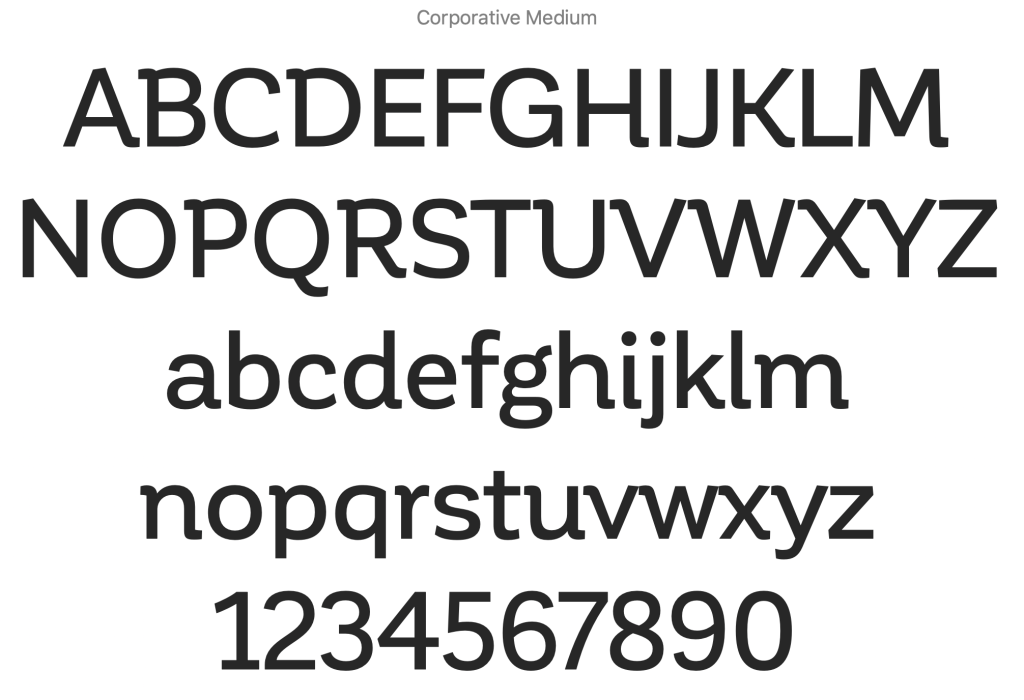
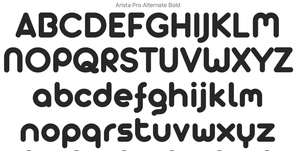
As working thru my font layouts I realized that my first choice of font-family was wrong. Corporative was not working at my original smallest function character size so I started to research what the predominant chat communities used for their apps. I found that the font-family was used was called Montserrat. A comparison of the two families can be seen below and it is easy to see why I chose to ditch my original font selection for the new set, with Montserrat’s more square san-serif case set the responsiveness of the font to become very visible why most chat apps use this font.

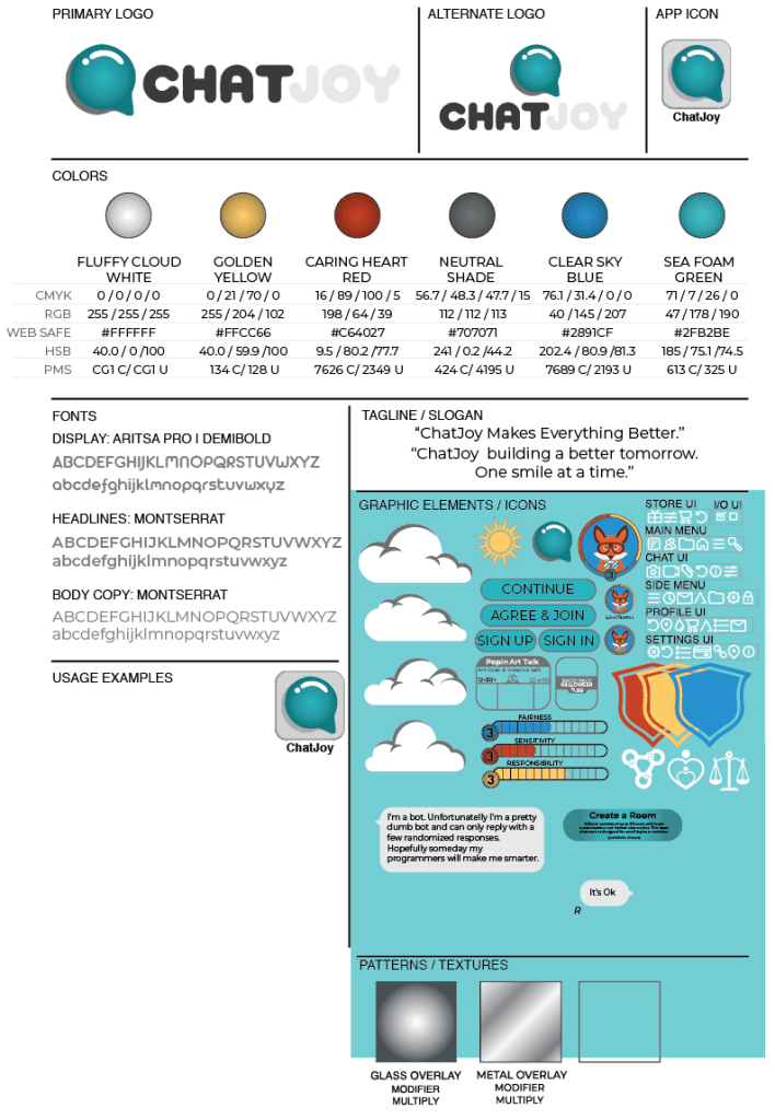
Of course, I used Montserrat for both my headings and body copy but my display font which is used to create the logo title text via some illustration modification remained the same as Artista Pro SemiBold / Bold.
I didn’t really modify the logo or the color sets but I added an additional appearance modifier for metallic overlays as well as the creation of additional Graphic element and icon modifiers. Also at this time, I was informed that my current icon set was too simple and could be mistaken at a lower resolution so I started the modification of the icon set so I could repair and redesign these elements. I will touch on this upgrade in a future post.
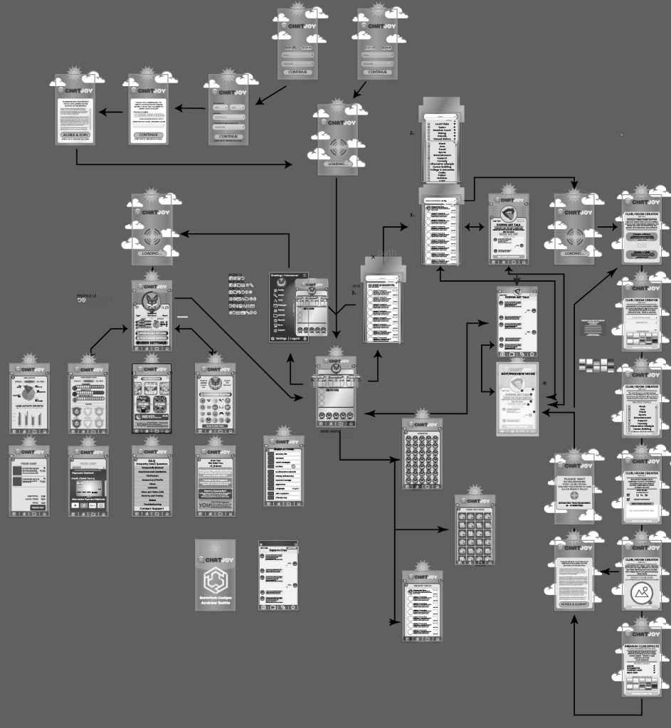
Progress Update 3
At this point, I completed all 40 Black and white Screen Slices so in my next blog post I hope to update you all with a detailed visual overlook of the app.