Progress update
The weekly task is to:
- Begin to design BW screens (10-15) in illustrator.
- Finalizing type, spacing, buttons size, and overall layout
before creating these Black and White Screens I first established a style guide that will be referenced later in this blog again when I am asked to create on in the future. I created this sooner than later in the project to visualize the actual logo and styles used in the layout of the app.
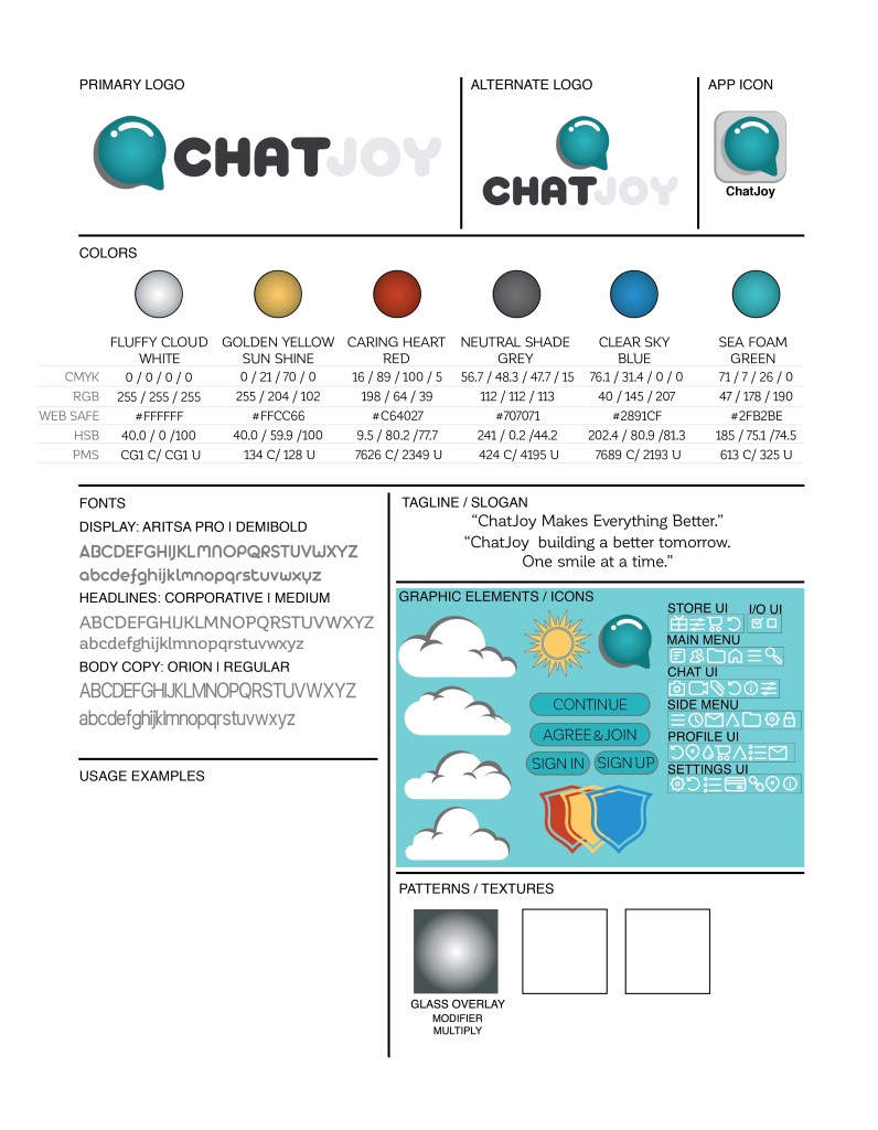
In my style guide, I outline how the logo for my App which was formerly known as Habitual Hero but now is known as ChatJoy will be used. I went with colors that can be described as “calming, relaxing, brilliant, electric, deep, harmonious & prismatic” these colors are built in such a way that wether in an RGB or CMYK Color mode the color’s hues don’t shift by a large range so that the screen view will not differ at all from the print application. I also chose a viable font that is legible at a minimum of 6pt to 100pt; the font family I chose originally but I will update this style guide again once I reach the full-color version of the app creation.
I also created a few basic graphic elements and iconography to help flesh out the app layout creation. As well as a glass overlay which is a gradient set to the appearance modification called multiply which adds a glass reflector to any color or element I create or chose to overlay.
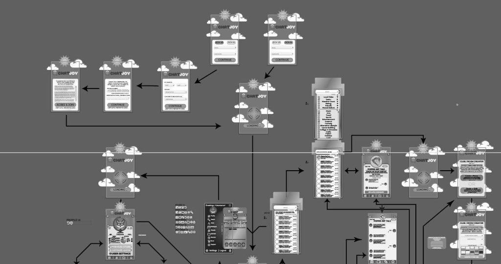
App Screens (Digital Web Slices)
As this is a progress update I have only included an overview image of the illustration artboard of my 17 current black and white App screens/slices.